Overview:
Nesis3 immerses players in a 3D puzzle platformer adventure, where they harness telekinetic powers to manipulate objects, unravel intricate puzzles, and traverse diverse levels.
UI Implementation:
UI Outline for Nesis3 Game Pause Menu:
- Pause Button:
- Using the escape key activates the pause menu.
- When clicked/tapped, it initiates the pause menu.
- Pause Menu Overlay:
- Upon clicking the pause button, the game screen has a blue overlay, and the pause menu overlay appears.
- The overlay covers the entire game screen.
- Menu Options:
- Resume:
- Resumes the game from the paused state.
- Upon selection, the pause menu overlay disappears, and gameplay resumes.
- Settings:
- Opens a submenu with various settings options.
- Options may includes sound settings, graphics settings, etc.
- Credits
- Takes the player to the Credits screen and returns the player back to the game after completion of credits or after early escape from credits.
- Quit Game:
- Exits the game entirely.
- Upon selection, a confirmation of use prompt appears to ensure the user does wish to continue with exiting.
- Resume:
- Navigation:
- Navigation through menu options is achieved using the mouse to hover over and select using left click.
- A visual indicator highlights the currently selected menu option.
- Visual Feedback:
- Each menu option should have a hover/selection effect to provide feedback to the player using sounds, shape language, and visual change to buttons.
- Background and Aesthetics:
- Fonts, colors, and visual elements align with the game’s overall art style to maintain consistency.
- Exit Mechanism:
- Provide clear instructions on how to exit the pause menu without selecting any option (e.g., pressing the pause button again, pressing a designated “Back” button).
- Testing and Iteration:
- Conduct thorough playtesting to ensure the pause menu is intuitive and responsive.
- Gather feedback from players and iterate on the design as needed to improve usability and user experience
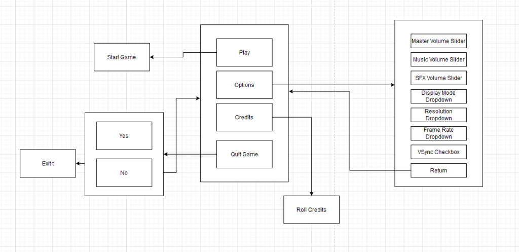
Following collaboration with designers and the UI/UX artist, we developed the initial flowchart depicting the in-game pause menu. This diagram was subsequently presented to the UI Artist.

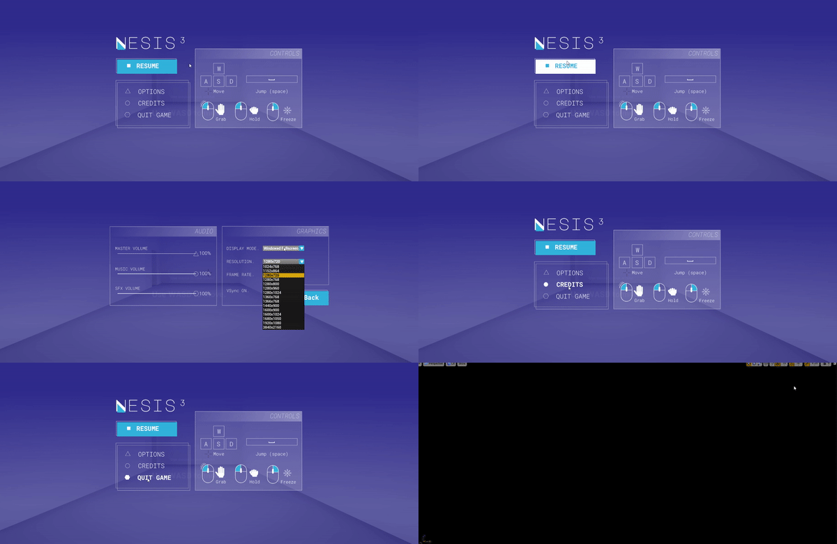
Overall, the completed version of the in-game pause menu combines visually engaging design with functional usability, enhancing the player’s overall experience in Nesis3.

UI Outline for Nesis3 Game Main Menu:
Just as with the in-game pause menu, a similar approach was taken to design and implement the main menu of Nesis3. Here’s an overview of how the same steps were followed:
- Menu Options:
- Start:
- Starts the player from the beginning of the game.
- Upon selection, the screen fades, the game transitions scenes, and fades into the beginning of the game.
- Settings:
- Opens a submenu with various settings options.
- Options may includes sound settings, graphics settings, etc.
- Credits
- Takes the player to the Credits screen and returns the player back to the game after completion of credits or after early escape from credits.
- Quit Game:
- Exits the game entirely.
- Upon selection, a confirmation of use prompt appears to ensure the user does wish to continue with exiting.
- Start:
- Navigation:
- Navigation through menu options is achieved using the mouse to hover over and select using left click.
- A visual indicator highlights the currently selected menu option.
- Visual Feedback:
- Each menu option should have a hover/selection effect to provide feedback to the player using sounds, shape language, and visual change to buttons.
- Background and Aesthetics:
- Fonts, colors, and visual elements align with the game’s overall art style to maintain consistency.
- Testing and Iteration:
- Conduct thorough playtesting to ensure the pause menu is intuitive and responsive.
- Gather feedback from players and iterate on the design as needed to improve usability and user experience

In summary, the same collaborative and iterative process used for the in-game pause menu was followed for the main menu of Nesis3, resulting in a visually stunning and user-friendly interface that matches the rest of the UI throughout the game.

Environment Behaviors:
The designers envisioned a dynamic environment filled with varied platforms and interactive doors, all controlled by pressure plates. Collaborating closely with fellow engineers, we successfully developed responsive pressure plates capable of seamlessly integrating with doors and moving platforms.
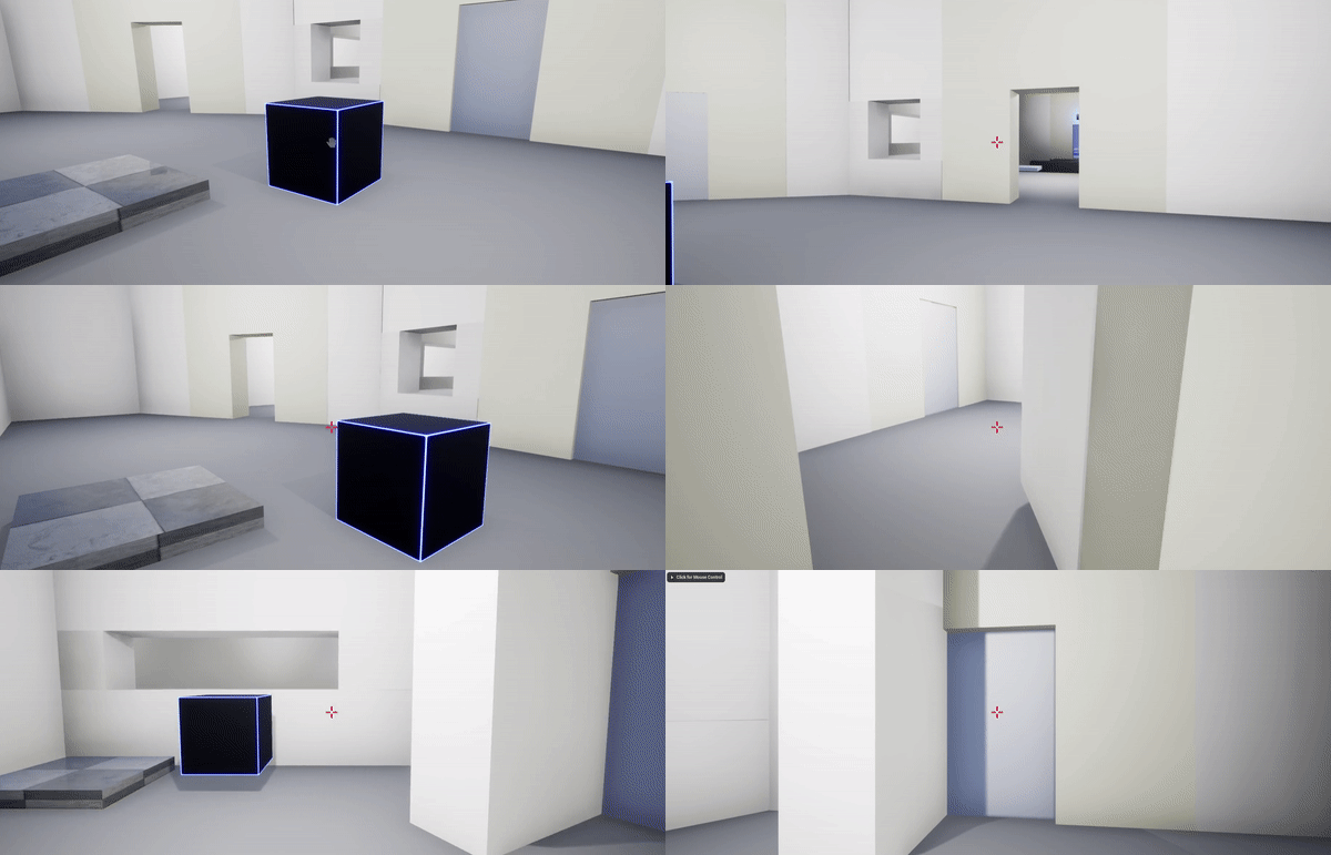
Here are some examples of the beginning puzzle mechanics that I created.


As the project evolved, the designers sought to elevate the challenge level with increasingly complex puzzles. To meet this demand, we devised an array of actors capable of responding to pressure plates. With this adaptable system in place, designers gained the flexibility to manipulate numerous objects as desired, empowering them to craft intricate and engaging puzzles

Following this, we introduced tangible key-like elements for players to collect. These keys are strategically positioned within designated areas, requiring players to solve puzzles to retrieve them. This dynamic adds pivotal steps, crucial for advancing through the game.
Video coming soon.
The Awesome Team!
Dustin Keplinger – Gameplay Engineer& Gameplay Designer
Quinn Beierle – Gameplay Engineer & Gameplay Designer
Carolyn Clarkson – UI/UX Artist